Most user interfaces - on both mobile and web - are based on a notion of grids. Grids basically consist on splitting the user interface in a bunch of aligned squares that can be merged together to create blocks. Using the grid principle while designing UI helps aligning elements, brings consistency, cleans up the code, ensures users can easily parse the content of the UI, etc. In a nutshell, grids are an extremely powerful designing tool.
Using the grid principle generally requires developers to add some extra padding/margin/spacing (choose the name that best fits your style…) between elements. Indeed, adding spacing between elements helps maintaining a clear separation between blocs while still maintaining high level of readability of your UI. All Android developers are familiar with these concepts and most cases are actually solved by using framework features such as padding and/or margin on Views. In order to clearly isolate the logic from the UI, this is generally done in the XML definition of the interface. While this works particularly great when the UI is quite static, it may be harder to manage dynamic UIs where elements get hidden/shown on demand. This article gives you some tips and tricks to better manage dynamic grid-base UI.
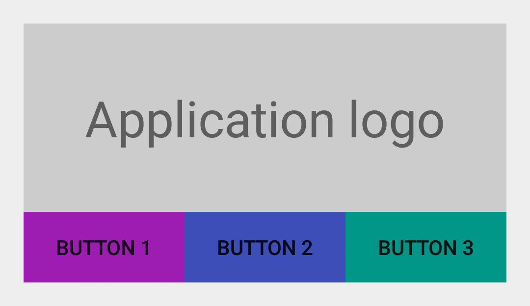
Let’s create a simple layout as an example. We create an horizontal bar of three Buttons that appears below a static View (the application logo for instance). The rendering of the following layout is given in the image below:
1 2 3 4 5 6 7 8 9 10 11 12 13 14 15 16 17 18 19 20 21 22 23 24 25 26 27 28 29 30 31 32 33 34 35 36 37 38 39 40 41 42 43 44 45 46 47 | |

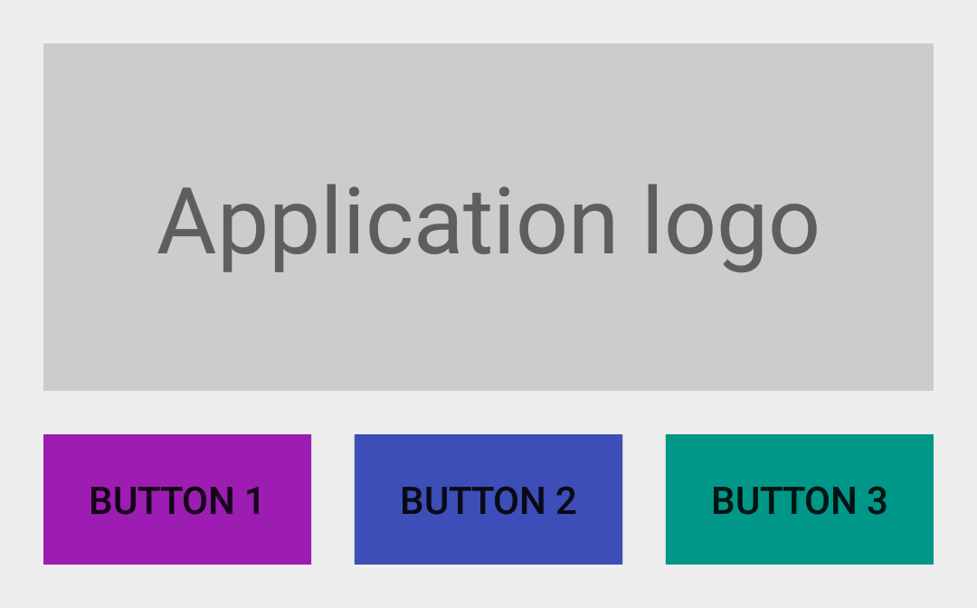
The user interface shown in the previous screenshot clearly relies on a notion of grid. However, it seriously lacks of spacing between elements in order to let the user clearly distinguish independent entities in the UI. Let’s do that be simply adding android:layout_marginTop="@dimen/spacing_medium" to the LinearLayout id-ed @id/buttons_container and android:layout_marginRight="@dimen/spacing_medium" to Buttons @id/btn_first and @id/btn_second:

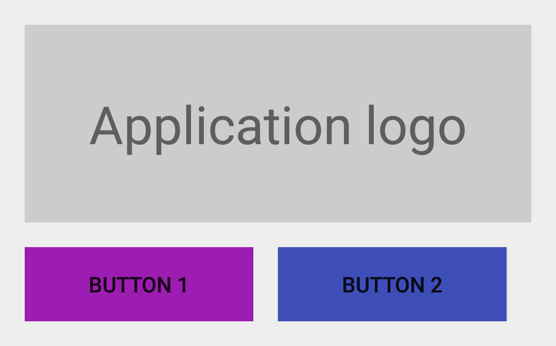
The UI above looks particularly great: it looks nice, it is readable, etc. Unfortunately, things get kinda bad when dynamically hiding some Views in the layout. Indeed, let’s imagine the feature normally activated by a click on @id/btn_third requires some capabilities that are not available on the device (for instance Google Play Services). The best way not to clutter the UI is to change the visibility of the third Button to View.GONE:

As expected, @id/btn_third is not displayed anymore but the right edge of @id/btn_second is not aligned with the right edge of the application icon. The main reason of this problem is the margin technique works well as long as it sticks to the assumption made at the beginning: each View with a right/top margin has a neighbour View on its right/top. Hiding some Views in the bar goes against this constraint.
An obvious trick to deal with this issue would be to manually change the margin of elements in the Java code. It is worth telling this is a really bad solution. Another way would be to use a layout that automatically deal with element spacing. GridLayout is one of them, for instance. Unfortunately, this layout is kind of a pain in the ass to use and doesn’t let you specify a specific margin between elements (only the default margin is available).
Actually, the LinearLayout already manages a notion of spacing between elements. This feature is quite unknown as pretty hidden in the framework but it works like magic. The trick consist on using a Drawable with an intrinsic width/height as the LinearLayout’s elements divider:
1 2 3 4 5 6 7 8 9 10 11 | |
You can now use this newly created Drawable as a spacer between elements by setting it as the divider of the LinearLayout:
1 2 3 4 5 6 7 8 9 10 11 12 13 14 15 16 17 18 19 20 21 22 23 | |

The Android framework contains a bunch of features that can be used and tweaked to fulfil a slightly different purpose than initially expected. The notion of Drawable is usually part of these tricks. Making sure you fully understand the concept of Drawable as it may help you simplify your code sometimes.