Note: I apologize to all diligent readers of this blog but I need to give a small reminder to those who have not read the two first articles of the ‘ListView Tips & Tricks’ series. I strongly suggest to all of them to look at the previous tips and tricks I have illustrated. Reading those posts is not mandatory but highly recommended as they may be mentioned here. Do not hesitate to learn more about emptiness handling and sectioning
Note: I do not know how many articles will be written in this series of tips and tricks about the ListView widget. In the second opus, I gathered all sample codes into a single repository on GitHub. This project will be augmented with each code I will be developing in this series. For instance, all of the code you will find in this page is already available in the ListViewTipsAndTricks project. You can clone/fork it at the following GitHub page:
http://github.com/cyrilmottier/ListViewTipsAndTricks
In the previous article, we have learned how to section data inside a ListView. I have also given you a few tips that might have helped you to improve performance in your application. Providing a very smooth and responsive UI is essential to users as mobile applications are a way for them to improve their productivity. Performance and responsiveness are great but I’m sure all of you know users are very demanding. They also want their applications to be user-friendly, easy-to-use and … beautiful. In this article we will focus on creating fancy and eye-candy ListViews
Along this post we will display a list of cheeses. I know this is far from being a great set of data (especially for a guy that never eat cheese like me). The reason for this is I preferred focusing on the actual code of the ListView rather the data-fetching code. I’m sure, you can all imagine cheeses as relevant and have enough imagination to consider cheeses like something more ‘accurate’: tweets, Google+ messages, etc.
Our goal in this post is to learn few tips to create well-designed ListView-based applications. ListViews are widely used on the Android platform and must be designed keeping in mind its actual purpose. For instance, the Contact app is regularly used but the time taken by a user to find a contact must be as quick as possible. To fulfill these requirements, the Android team developed a very easy-to-read ListView: clean, containing as few texts as possible, large texts, plain background color, white texts on black background, etc. Even if this is great for the ‘Contact’ app, this is not a perfect and generic solution. Conversely, the ‘Messages’ app contains a ListView designed to be used as often but in a slower way, rarely flinged, differentiating each participant of a conversation, etc. The solution to this problem has been to create a ListView with various background colors, a small but readable font, using grey color for less important information, etc. In other word, a smooth ListView is not enough: you have to design it constantly thinking about the way your customers will use it.
The starting point
Let’s start by creating a ListActivity displaying our list of cheeses. The first step is to create a layout containing our ListView. The code below shows you the layout we will be using afterwards in this article. You can also find a graphic representation of this layout in the screenshot below.
1 2 3 4 5 6 7 8 9 10 11 12 13 14 15 16 17 18 19 20 21 22 23 24 25 26 27 28 29 30 31 32 33 34 35 36 | |
As you may have noticed, the layout contains a ‘bottom bar’ with two Buttons. We could have created a very basic layout … or even not creating one at all and letting the ListActivity create a full-sized ListView but we will actually use those Buttons in the rest of this post to switch between different ‘styling’ methods.
The code of our basic ListActivity is given below:
1 2 3 4 5 6 7 8 9 10 11 12 13 14 15 16 17 18 19 20 21 22 23 24 25 26 27 28 29 30 31 32 33 34 35 36 37 38 39 40 41 42 43 44 45 46 47 48 49 50 51 52 53 54 55 56 57 58 59 60 61 62 63 64 65 66 67 68 69 | |

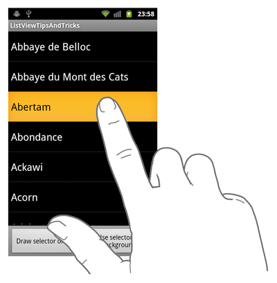
If we look at the overall appearance of this UI, we have a very basic ListView with a black background. When the user taps an item, the background of this itemview turns orange while the text turns black. Where do those colors come from? In the source code of our application, there is no reference to colors nor Drawables. The actual reason is all styles come from the Application/Activity theme. As we have set no theme to our application, the default theme (@android:style/Theme) is used.
List selector
Let’s start customizing our ListView! The first thing we can change from the default theme is the color of the pressed itemview. In order to do that, we will use the android:listSelector XML attribute which is equivalent to the ListView.setSelector(int) method. The list selector is a Drawable drawn by the ListView as the background of the pressed/focused itemview. The ListView manages all types of Drawables but the preferred Drawable is usually the StateListDrawable. This Drawable changes its appearance based on its current state (focused, pressed, selected, etc.). The capture below shows the list selector we want to develop in the focused and pressed states:

Note: As some of you may know, I am a huge fan of Android Drawables. I think they are one of the most amazing features of the Android UI toolkit. They are so powerful I have given a talk named “Mastering Drawables” during the Droidcon (London - 2010) as well as the Android Developer Labs (Paris - 2010). If you want to know more about Drawables, you can have a look at the slides (in French only … it seems I have lost the English version of those slides) on Slideshare and the sample codes I made on GitHub
Edit (2011-09-24): I finally succeed to find the English version of the slides. You can download them here
In this example, we will create a brand new list selector that displays a nice gradient beneath the pressed/focused itemview. The first thing we need to do is to create two GradientDrawables: the first one for the pressed state and the second one for the focused state. The GradientDrawables below are respectively called list_selector_pressed.xml and list_selector_focused.xml and can be found in the res/drawable folder:
1 2 3 4 5 | |
1 2 3 4 5 | |
We can now create our own list selector that references the two previous Drawables (this is where the magic happens). This file is located in the res/drawable folder and its name is list_selector.xml:
1 2 3 4 5 6 7 | |
The only thing we need to do now is to apply this brand new list selector to our ListView. You can do it by adding android:listSelector="@drawable/list_selector" to the ListView tag in your layout.
Note: Using a color as part of your list selector may entirely fill your ListView. This problem comes from the fact a ColorDrawable does not respect its bounds: it entirely fills the clip rect of the Canvas in which it is drawn into. I have always considered this as a bug but nothing has been fixed until … Android 3.0 (Honeycomb)! As a result, using a ColorDrawable in your list selector is strongly discouraged. Fortunately, this article is entitled ‘ListView tips & tricks’ and here is an easily way to get round this bug: instead of setting a ColorDrawable, use a Drawable that respect its bounds such as a GradientDrawable or a NinePatchDrawable. The code below shows a GradientDrawable that can be used in replacement of a regular ColorDrawable.
1 2 3 4 5 | |
Miscellaneous styling
ListViews provides a lot of “styling” features. In this paragraph we will focus on various methods that may be used to style your ListView. Please note those most of those tips are given “as it” and are not part of the sample code.
Cache color hint
By default, an Android View has a transparent background. Although it seems natural … transparency involves a lot of calculation when rendering your application on screen. In order to avoid blending and make the rendering faster while scrolling/flinging, the ListView widget uses a ‘scrolling cache’ mechanism. This mechanism consists on taking an opaque screenshot of all visible child Views (in other words, it draws the content of each itemview in a Bitmap) and directly draws those screenshots when necessary. The color used to make those screenshots opaque is the one given by the cache color hint. If your ListView turns opaque (black for instance) when scrolling that because you need to set the cache color hint to the actual color of your ListView background. Setting this property @android:color/transparent will fix the problem but will also disable the optimization …
If you want to know more about the cache color hint optimization I strongly recommend you to have a look at a really great article written by Romain Guy. You can read it on the Android Developer Blog
Divider
Contrary to the ScrollView widget, ListView has a built-in support for dividers. By default, a divider is a 1-pixel tall line that is used to separate two itemviews. You can style/modify this property with the android:divider XML attribute. Setting a new divider can be done with a color or a Drawable. When drawing the content, the ListView will automatically look at the height of the divider to part the itemviews. In other words, it means you can use a very complex Drawable as divider and your ListView will automatically measure it and draw it when necessary.
This looks amazingly powerful and easy, isn’t it? It actually is … but there is little a problem. Some Drawables (for instance the ColorDrawable) has no intrinsic height (which means a call to Drawable.getIntrinsicHeight() returns -1). In order to by-pass this problem, ListView provides a android:dividerHeight XML attribute that asks for a dimension.
Note: The previously detailed problem concerning the un-respected bounds does not apply to dividers. This is odd, isn’t it? Indeed, ListView has an internal mechanism clipping the Drawable to the correct rectangle on screen when the divider is a ColorDrawable. As a result you can safely use colors when styling your dividers.
Fading edges

By default, a ListView fades away at the top and bottom edges once the content is larger than the actual size of the ListView. This property is called fading edge and can be easily removed or modified using android:fadingEdge and/or android:fadingEdgeLength. You can look at the sample code of this post in which I have prefered removing this Android feature by adding a android:fadingEdge="none" in the XML attributes of our ListView.
ColorStateList
Sooner, we have discovered a way to create a custom list selector. If you look closely to the image, you will notice the text has a different color between the normal and pressed states. Changing the text color may be mandatory in some cases where the background color of a pressed itemview is very close to the color of the text. In order to change the color of the text depending on the current state of the itemview, you can use a ColorStateList. I will not describe how to use it here but you can take a look at the framework documentation. This class and its use is described very clearly in the Android developer guide
Overscroll Drawables
Since Android 2.3, ListViews gives a visual feedback when the user tries to scroll the content of the ListView over its bounds. This feedback looks like a ‘halo’ at the bottom/top of the ListView. You can set your own Drawable using one of the setOverscroll[Footer/Header](Drawable) method.
Customizing itemviews background
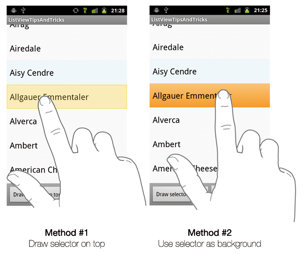
Changing the background color of a ListView can be rather complex. The next part gives you a few tips and tricks you can use to create eye-candy and unique ListViews. Our goal is to change the background of our UI to a light color. We will also try to emphasize some cheeses by setting the background of their itemview to a more noticeable color. The screenshots below shows our final ListView depending on the method used:

ListView background
The simplest approach of changing the UI background color is to change the background color of the ListView. In order to do that, we simply have to use the android:background XML attribute or one of the setBackground[Color|Resource|Drawable] method.
The main problem with this approach is the background is applied globally. In other words, it means you don’t a control over each itemview as the background applied to the entire ListView. This works particularly great with a plain color but this method will not allow you style two itemviews differently.
Itemviews background
In the previous method, we have chosen to change the background of the entire ListView. If we want to have a control over each itemview appearance it makes sense to change the background of each of our itemviews independently. The code below shows you how to apply a background depending on whether the underlying data is special or not:
1 2 3 4 5 6 7 8 9 10 11 12 13 14 15 16 17 18 19 | |
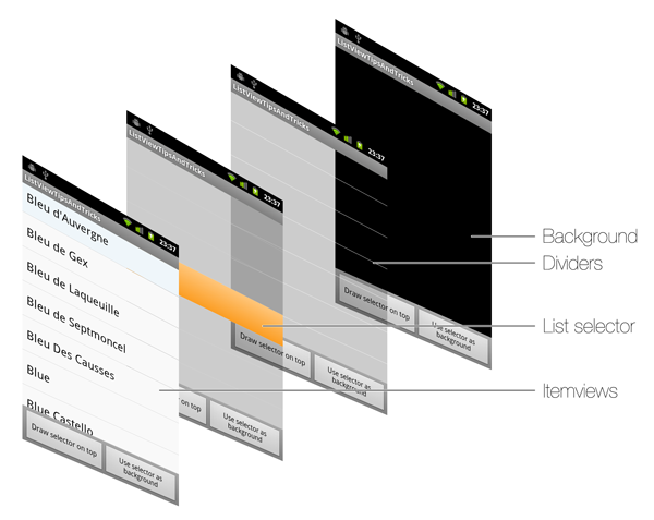
If you compile and run this example, everything will work perfectly fine … until you try to press an itemview. Indeed, using the previous technique, the customized list selector we created never shows up. It may look like a bug at first but this is actually completely normal. Let’s look at how things are drawn the following diagram (you can click on the image to access to a larger version):
As you can see, Android first draws the ListView background as well as the dividers. Then, the system draws the list selector. Finally, ListView renders all itemviews on top of that. Thanks to this diagram, it is clear the list selector will never be visible with opaque background set to itemviews. Fortunately, I have a listed a few solutions you can implement.
Drawing selector on top
The ListView or more globally the AbsListView offers a android:drawSelectorOnTop XML attribute and its Java equivalent setDrawSelectorOnTop(boolean). As mentioned in the method’s name, setting this property to true will indicate the ListView to draw the selector on top of each itemview. Even if this looks like a good option, drawing selector on top does not allow you to have opaque list selector as the content of your itemview will be completely hidden.
OnItemClickListener and OnItemSelectedListener
I have seen a lot of samples over the Internet using the OnItemClickListener and OnItemSelectedListener in order to be notified the background must be changed to transparent … This can work but I think this is a pure hack considering the features available in the Android framework. Even if this technique is probably great on some mobile platforms could you please guys stop using it on the Android platform. This is not a correct nor easy way to do it on Android. As a result, you can probably guess why there is no line of code in this article explaining the hack.
StateListDrawable
As we have seen previously, our biggest problem comes the fact the background is opaque and hides the list selector when the itemview is pressed. Hence, we need to find a way to make the background transparent when pressed. This looks like something we have already done and some of you may have understood where I want to get to … Hurray, you are right! The trick consists on using a StateListDrawable as the background of each itemview. This Drawable will have the exact opposite behavior of the list selector: it will be opaque by default and will become transparent when pressed, focused or selected. The code below refers to the list_selector_normal.xml (the list_selector_special.xml is very similar and is not available here. Look at the sample code for more details):
1 2 3 4 5 6 | |
This trick can even be pushed to its paroxysm by setting the list selector of your ListView to null or a transparent color and letting each itemview handle the all states itself. You only thing you need to do here is to create a final StateListDrawable containing the background (normal state) as well as the gradient used as visual interaction feedback (pressed/focused state). This method works pretty well and does not suffer from the previously mentioned problem regarding ColorDrawable (the color is drawn at the itemview level not at the ListView level) but it does not force you to have consistent pressed/focused states between your itemviews. Even if it is usually okay to have different Drawable for the ‘normal’ background it is generally not recommended to have different Drawable between itemviews.
Conclusion
Although we have just scratched the surface of the styling possibilities, you now have a large set of keys to design eye-candy ListViews. Do not hesitate to use those tips always keeping in mind what the important questions are: “What’s the real purpose on this ListView?”, “What are my users' expectations?”, “Do I need to focus on productivity, readability, efficiency or something else?”, etc.
I hope you have appreciated this article. I know it is quite a long post but let’s say this will be the only one I will be posting this month of holidays. Do not hesitate to leave a comment below if you have questions, if you think I have made a mistake somewhere or simply if you want to thank me for this! Have fun styling your ListViews!
