Note: When I started writing this post I decided to entitle it ‘Add accessories to your itemviews’. The biggest problem with this title is it doesn’t give an easily understandable overview of the post’s content (except maybe to iOS developers). The word ‘accessory’ is actually extracted from my iOS experience: it defines a view (clickable or not) that can be added to a UITableViewCell(base class for itemviews in iOS) and is often used to give an indication, a state or an access to any secondary information. Even if this word is not clear at first glance, it is insanely concise. As a result, I decided to use it in the rest of this article. To sum up, Android developers can consider ‘accessories’ as ‘secondary Views in itemviews’
Note: As usual the source code of all examples given in this series of articles is available on GitHub. I strongly suggest you to clone the repository and have a look at it while you are reading this post. You can clone it, fork it or directly download a zip file of it using the following link:
http://github.com/cyrilmottier/ListViewTipsAndTricks
As you may have imagined reading this series of tips and tricks articles, ListView is probably one of the most used widgets in the Android framework. Most of the time, a ListView displays a large set of similar data: contacts, text messages, emails, etc. Of course, you can have a lot of actions associated with each item in the ListView. In a contact application for instance, you may want to look at the details of a given contact or simply send him/her an email. The most common approach to perform such an action on Android is obviously to let the user click on the item and to display a new screen giving all the contact’s information: the detail screen. The latter finally lets you access to secondary actions and allow you to directly send him/her an email.
The biggest issue with the workflow previously described is it is pretty cumbersome to send an email to one of your contacts: first you need to find him/her in the list, then click on the associated itemview, search the email link in the detail screen and finally click on that email link … Reeeeeaaalllly borrriiiing! A great solution on the first versions of Android would have been to use the ‘long press’ gesture. A user long-pressing an item could access to important actions. Unfortunately, I consider this gesture as an anti UI pattern because it is far from being user-friendly. Indeed, people are incapable of finding this gesture as nothing indicates it on screen. With the increase of screen sizes on Android devices, another possible pattern is to add a clickable area in your itemviews: an accessory
A lot of Google applications uses this accessory UI pattern. For instance, the Contacts application allows the client to directly call a person from the contacts list. The Clock application also contains a ListView giving a list of the available alarms. You can (de)-activate an alarm directly from the list. Additionally, other examples of ListViews with clickable areas are applications letting the user star an item directly from the list.
Cheeses … again!?!
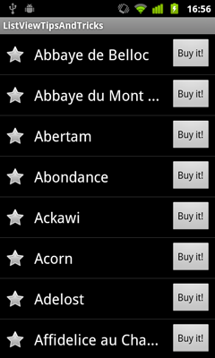
Even if I don’t like cheese in general, I decided to continue playing with a large set of them for the purpose of this article. In order to get a pretty interesting example, I have decided to create a layout for each itemview containing three Views: a CheckBox that can be used to star a particular cheese, a TextView displaying the name of the cheese and a “Buy it!” Button. The first version of our layout (res/layout/accessories_item.xml) is given below:
1 2 3 4 5 6 7 8 9 10 11 12 13 14 15 16 17 18 19 20 21 22 23 24 25 26 27 28 29 30 31 32 33 34 | |
The code used to populate the ListView and bind data to the layout introduced above is given below.
1 2 3 4 5 6 7 8 9 10 11 12 13 14 15 16 17 18 19 20 21 22 23 24 25 26 27 28 29 30 31 32 33 34 35 36 37 38 39 40 41 42 43 44 45 46 47 48 49 50 51 52 53 54 55 56 57 58 59 60 61 62 63 64 65 66 67 68 69 70 71 72 73 74 75 76 77 78 79 80 81 82 83 84 85 86 87 88 89 90 91 92 93 94 95 96 97 98 99 100 101 102 103 104 105 106 107 108 109 110 111 112 113 114 115 116 117 | |
Even though some methods still need to be implemented and the code does not work properly, you can already launch it. Once the AccessoriesListActivity is displayed on screen we can observe the rendering is as expected:

Getting the position of a View in a ListView
The first problem we may encounter when implementing the OnClickListener as well as the OnCheckedChangeListener is to determine the position (in the Adapter’s data set) of a Button/CheckBox. Because of its reuse mechanism, the ListView creates a pool of N itemviews where N is roughly equal to the maximum number of visible itemviews at a given time. This mechanism minimizes allocation of Views and prevents the application from crashing with an annoying OutOfMemoryException. Reusing objects results in a significant performance boost but may makes the code more difficult to write, use, understand and debug. Fortunately, the ListView API provides a lot of very handy methods. In our case, the method whose signature is int getPositionForView(View) will help us. It returns the position within the Adapter’s data set for the given View. The given View should be an itemview or one of its descendants. This method may look ‘magical’ but you have to respect a particular contract when using it. As a result, I strongly encourage you to have a look at the method’s description in the Android documentation)
Thanks to the getPositionForView(View) method, we can now easily implement our listeners:
1 2 3 4 5 6 7 8 9 10 11 12 13 14 15 16 17 18 19 | |
If you start playing with the new code (especially with the stars Buttons), you will probably end up with a crash. This crash actually comes from the neglecting to entirely read the protocol to follow for using getPositionForView(View). The description states that the given View must be visible in the AdapterView at the time of the call. When a View is being reused (it has not yet been reattached to the ListView and is not visible), getView sets the state of the CheckBox to the one stored at the correct position in mStarStates. The CheckBox source code will automatically callback the OnCheckedChangeListener in case the state changes. Therefore, our code may call getPositionForView(View) on a View that is not yet attached to the ListView.
Naturally, fixing this problem could be done by wrapping the getPositionForView(View) in a try-catch block where the catch clause does nothing. To be honest, I think this is a really hacky way to fix the problem and it shouldn’t be natural. Using Exceptions to bypass an issue you don’t understand is usually an evidence of your mediocrity. Therefore, I prefer explaining you how to do it in a more ‘correct’ manner. The code below shows you how to temporarily stop listening to the OnCheckedChangeListener.
1 2 3 | |
To be honest, I don’t like this snippet of code either but I think the problem actually comes from the fact the Android API is incomplete. The onCheckedChanged API should have an additional boolean argument flagging whether the change has been done programmatically or after a user action.
Why, the hell, are my itemviews no longer clickable?
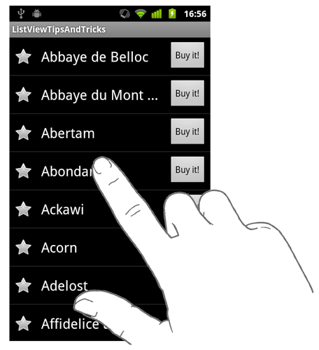
Our Activity is now almost completely functional. You can star a cheese in the list, buy it using the “Buy it!” button but you can’t have information about a cheese in particular. The regular way to do it would be to click on the itemview. Unfortunately, if you try to do so, you will notice it is no longer clickable (as shown on the graphic below). Actually none of the itemviews can be clicked. This behavior is often considered as a bug by Android developers (issue #3414). Personally I consider it as half of a bug …

Android has been primarily designed for a large set of input methods. The entire system is completely capable of working with no touch screen. To navigate through the UI, the user can use a directional pad which focuses Views after Views if and only if those Views are focusable. By default, all Android controls are focusable. In order to prevent having controls that are not focus-reachable, the ListView will simply prevent the selection (and click) of an itemview. By design, the ListView blocks clicks of itemview containing at least one focusable descendant but it doesn’t make the content focus-reachable calling setItemsCanFocus(true).
The trick to overcome this design issue consists of removing the focusability property of all itemview’s descendants. You can obviously do this by adding android:focusable="false" on all of your controls but the preferred, clearest and easiest way to do is to block focusability from the itemview root ViewGroup. Focusability can be blocked using the android:descendantFocusability XML attribute:
1 2 3 4 5 6 7 8 9 10 | |
Note: Because of this trick, your layout no longer works using a directional pad or a trackball. Indeed, we cannot select a accessories of an itemview. I don’t consider this as a major problem because most Android devices are now based on a touch-screen and the Android Market automatically adds a hardware requirement for a touchscreen to all applications (android.hardware.touchscreen). If you want your code to be safe, you can add a <uses-hardware /> tag in your AndroidManifest.xml
Don’t press everything!
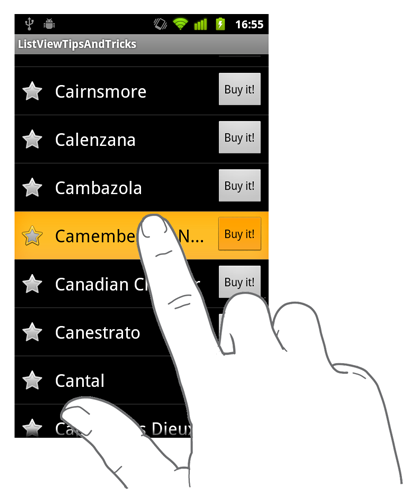
We finally did it! Our ListView runs magnificently!. Thanks to the code we have previously implemented, we have 3 possible actions for each itemview: star, buy and get info. This is great but that is not enough from my ‘perfectionist’ point of view. Indeed, many of you now know I do not consider an application or some code as finished if it is not well designed nor user-friendly. A lot of bad Android developers prefer focusing on functionality rather than the design. To be honest, I think this is one of the biggest danger the Android Market has to confront. Developers don’t understand users care more about the way features are designed (in term of UI and UX) in an application rather than the number of available feature. In our case something might have drawn your attention away. When pressing an itemview the CheckBox and Button turn yellow. The issue is demonstrated on the following screenshot:

The reason of this is Android, by default, recursively dispatches the pressed state of a ViewGroup to all of its children. Even if this behavior is completely natural most of the time, it may make your UI less polished and understandable. As we have seen in this example, each itemview features 3 actions. Each of those actions are completely independent. As a result, interacting with one should not act on the others.
The first, easiest, but bad solution would be to make sure the Drawables used by the Buttons don’t depend on the current View state. This means we would have to remove all of the ColorStateLists and StateListDrawables from our Buttons. It would prevent the Buttons from being highlighted when the user presses the itemview … but also when the user presses the Button itself! In other words, the user would have no feedback when interacting with our accessories which is a really poor user experience. As a conclusion: DO NOT do this!
The correct solution is to make sure our Buttons don’t ‘accept’ the pressed state when the parent is already in the pressed state. This can be done very easily by creating a new class extending Button and overriding the setPressed(boolean) method. Let’s call these new classes DontPressWithParentButton and DontPressWithParentCheckBox:`
1 2 3 4 5 6 7 8 9 10 11 12 13 14 15 16 17 18 19 20 21 22 23 24 25 26 27 28 29 30 | |
To conclude, we need to use those new classes in the layout used for each itemview:
1 2 3 4 5 6 7 8 9 10 11 12 13 14 15 16 17 18 19 20 21 22 23 24 25 26 27 28 29 30 31 32 33 34 35 | |
Polishing the user experience
The accessory UI pattern drastically enhances user experience. However, a bad implementation of the pattern can be terrible as the user may have a lot of difficulties to tap on a clickable View. As a result, when developing an accessory, you need to make sure it is easily clickable. The best way to do it is to use large Buttons. In general, consider a square of 30dp as the minimum clickable area you can add to a layout.
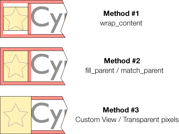
Having large Buttons in your UI will obviously improve user experience but it may make your application design look rough. A common trick when designing your accessories is to use an expanded touchable frame. The expanded touchable frame concept consist on surrounding the current design with transparent pixels. This frame enlarges the touchable area. Consequently, your design can stay sharp and tiny while the touchable area remains large enough to be easily clicked. You can enlarge a touchable area simply by adding a frame of transparent pixels around your design or simply using the padding attributes of a View.
In our example, the biggest problem rely on the difficulty to click on the star. In order to expand the touchable region, we will simply change the way the CheckBox is laid out on screen. Instead of vertically wrapping to the content and centering into the parent, we can fill the parent (fill_parent or match_parent for API level 8+) and set the content gravity to Gravity.CENTER_VERTICAL (which is the default vertical gravity in CheckBox).
1 2 3 4 5 | |
Another great optimization could be to move the padding from the itemview to the CheckBox to get a touchable area as large as possible without changing the overall UI. To my despair, it is not possible because the CheckBox widget is poorly developed: it doesn’t take into account the padding when no text has been set and it draws the button Drawable regardless of the horizontal gravity. As a result, here are your options:
Add a 6dp transparent pixels frame directly in your star
Drawableand stop using the padding attribute. Unfortunately, it implies modifying a lot ofDrawables and you will end up having some new resources in your res/ directory. Moreover, you will decrease your application ‘platform consistency’ because yourDrawables will no longer come from the system you are currently running on.Create a custom
Viewthat measures/draws itself correctly. This is the best solution to our problem that could also allow you to fix the listener problem by adding a new ‘fromCode’ parameter to the callback method.
The graphic below sums up how the touchable area changes depending on the implementation method:

Conclusion
That’s all folks! You now know how to correctly add clickable Views in itemview. The ‘accessory’ UI pattern can be pretty helpful but take your time when implementing it. The time you are spending polishing it will assist your users and make them happy. Prior to integrating the accessory UI pattern to your ListView, try to focus on the actual purpose of your application: What’s really important for my users? Do they need a list which is clear or functional?. Indeed, the accessory UI pattern probably speeds up the completion of a task but it may also ruin the clearness and simplicity of a UI.
To finish, I would like to thank the people who helped me fixing errors from the original texts. They made my posts more pleasant to read and, most of all, more professional. With this fourth article, I have finished talking about all the techniques I had in mind when I started the ListView Tips & Tricks series. I sincerely hope you loved it as much as I enjoyed writing it: it was a very demanding task but I consider this series as my contribution to the refinement of all Android applications. I can’t wait to see great Android ListView-based applications on the Android Market.