Note: This article may target a Google product, it has to be read in a more global manner. It does not focus an a particular problem but rather on a large set of problems I encounter everyday. I decided to use this case because I believe the considerations given in this article should apply particularly to this specific case.
Most of my readers probably consider this blog as a technical blog. Let’s be honest: you’re right … at least partially! I agree I mostly write technical articles dealing with Android development. Nevertheless, you may have noticed I’m also always studying things in minute detail: source code, user experience, user interfaces, design, communication, etc. Thanks to this quality (some may consider this as a flaw because it makes me complain all the time and forces me to spend a lot of time attentively looking at things), I have discovered an amazing news!
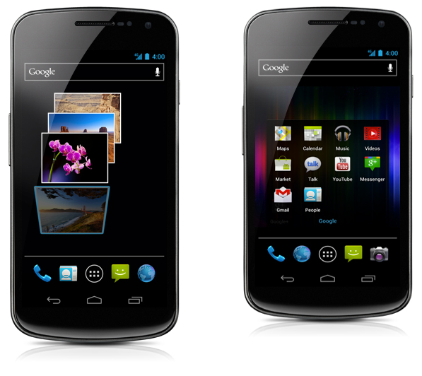
Being obsessed by detail (to be honest I don’t consider myself as actually “obsessed” … I just think I see things, how greatly or badly designed they are, etc.), I have a huge news for you today! Indeed, for the past two months, Google has been lying to us. There is not one, but two Galaxy Nexus!!! Don’t you believe me? Go to the ‘Features’ page of the official Nexus website and have a look at the proof.

Don’t you see? Google is featuring two different sizes of Galaxy Nexus … I’m sure they will soon announce a new model of Galaxy Nexus with a different screen ratio … maybe … or maybe not … OK I’m just kidding. I just wanted to teach you how details are important. They demonstrate the attention and passion you’re giving to your product and everything that is gravitating around it. The more care you give to a product, the greater it is.
Let’s go back to our case. This morning, I noticed Google has updated the Nexus website. It drove me mad when I saw Google has scaled some of the images with no respect of the ratio. Because of this, they are creating a new and virtual Android device. I’ve rapidly looked at the source code and it looks like the problem lies in the fact the original image is not scaled properly in the HTML source code. I really don’t understand how such an error can happen. What could have come into developer’s head when he/she decided to scale the image without respecting the original ratio? So please guys, always respect the ratio of a picture. Morevover try not to let the browser scale the images for you. You don’t know about the resampling algorythm used by the browser (nearest neighbor, bilinear, bicubic, etc.). Resampling images on your own will allow to find the best option.
I have also found some other mistakes. Here are some of them:
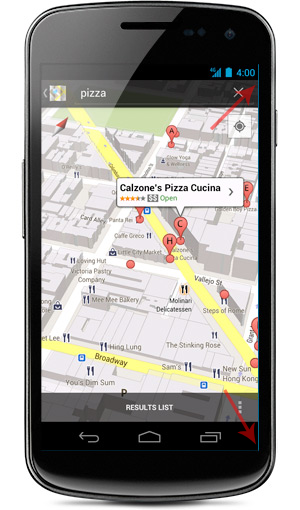
- A magic but very weird blue line appears on the right of the screen. Do you really want to buy an Android device constantly showing a blue line on the right?

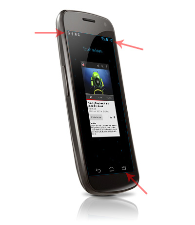
- All Galaxy Nexus pictures are consistant in term of “notification area”. They all give 4:00, a full battery and a full 4G reception. All but one … We also have a strange surrounding blue corner on this screen.

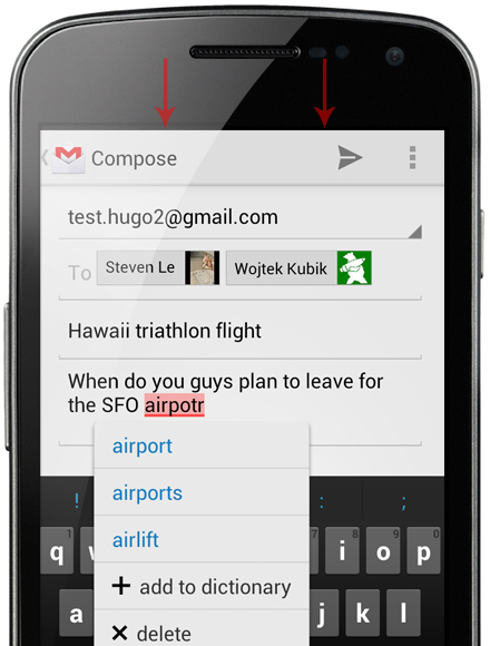
- I don’t have a Galaxy Nexus nor Ice Cream Sandwich on my device but I doubt GMail decided to use the full screen mode in order to remove the notification bar to the ‘Compose screen’:

The conclusion of this article is obviously to pay attention to details. Apart from the fact you may make me die of a heart attack, you are neglecting your customers. Stop looking at a product (an application, a device, etc.) as a big black box. A product is always way larger than itself. Do consider a product as a large open box in which thousands of people are going to look into. This box does not just contain the product itself. It contains images, videos, slogans, colors, etc. that reflect your product, spread the spirit of your product all around the globe. As a result, if you really want to have an amazing impact on your audience and to spread how insanely great your product is, you have to make sure the bits of information are as perfectly designed as the original product. There is no such thing as a small or minor detail.